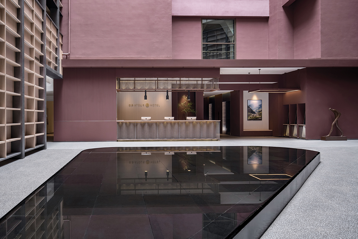
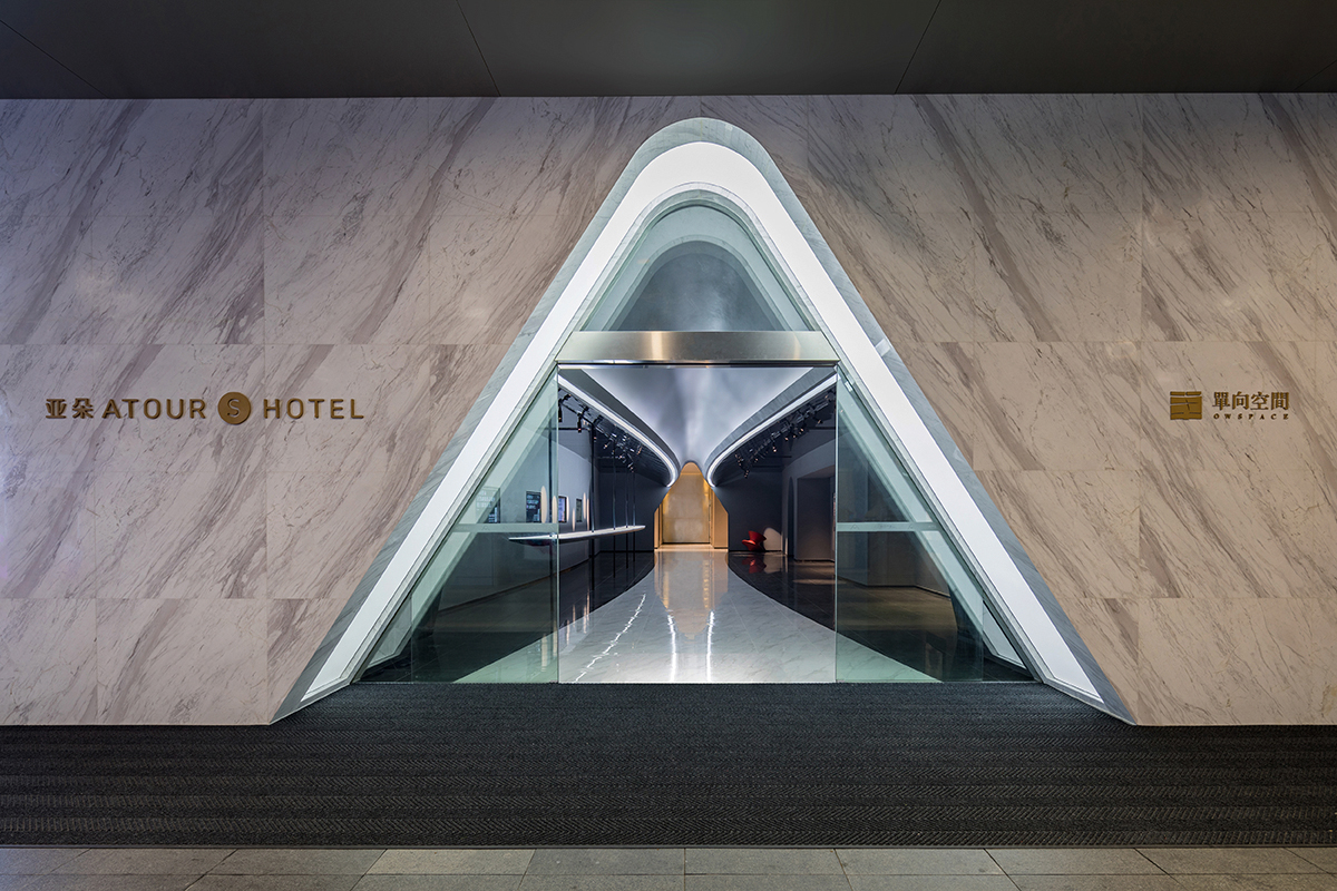
The project draws inspiration from the concept of “SAVHE”- meaning “the respiration” in the language of LISU minority group, which is traced back from the place where the hotel brand of “Atour” started. We reshape the originally wasted open space inside a service apartment and transform it into a spiritual space “SAVHE” for the hotel. It features a reading function and creates a moment of reflection in the hustle-bustle of the city. To enter the hotel, visitors are guided through an exhibition space at ground level and brought up by elevators to the reception on third floor. The exhibition area is designed as a “time tunnel” that aspires to create a surrealist experience of travelling in outer space. The journey brings visitors passing through art works and reshapes their state of mind before check-in. An illuminated pitched ceiling, inspired by the company logo, hovers above the dark space as an eye catcher, attracting people from the street to come in.
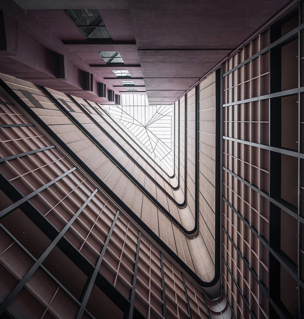
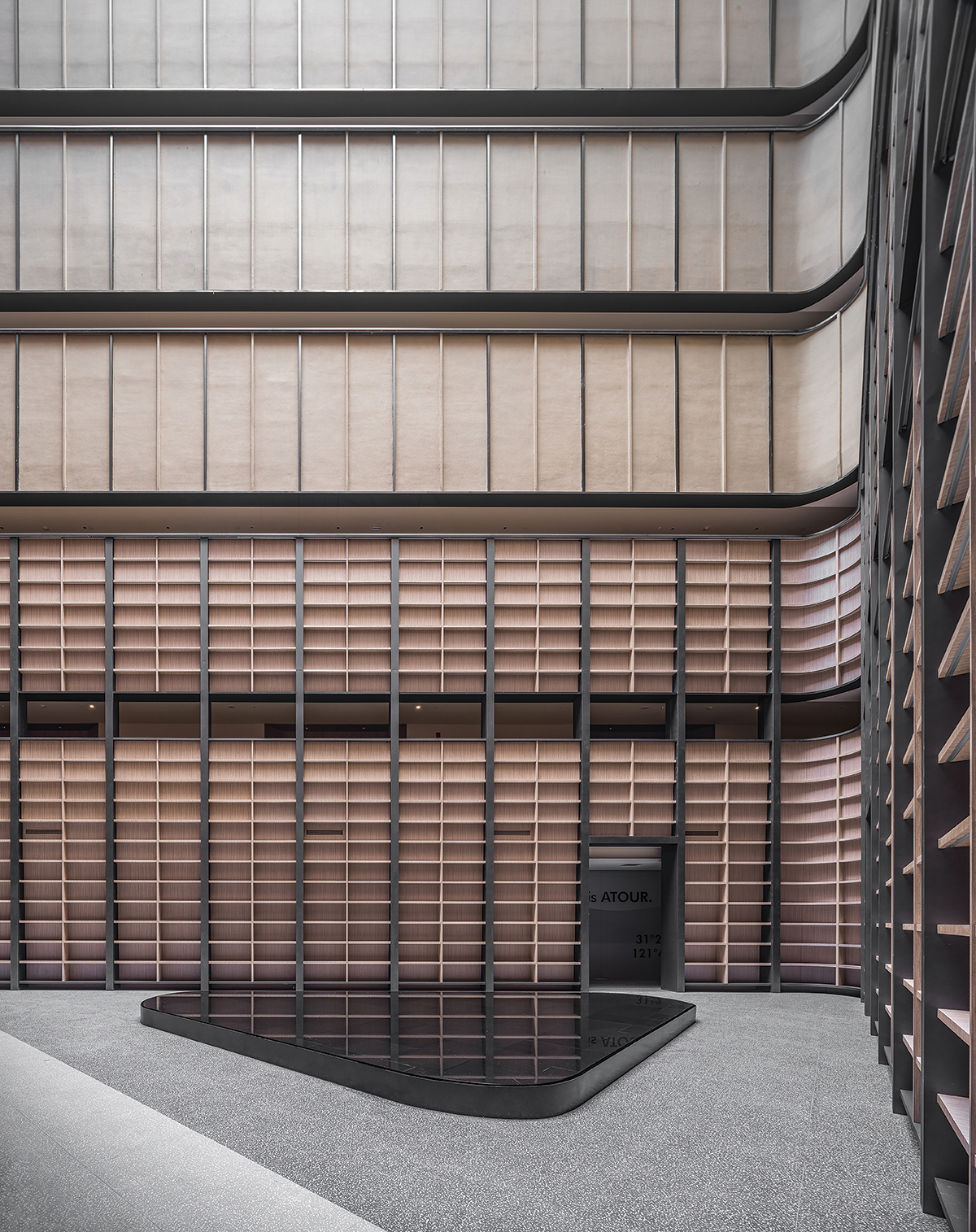
The hotel reception features a triangular atrium of 7 levels- the “SAVHE”. The “SAVHE” is designed to achieve “A moment of Respiration”, where the visitors are invited to slow down, pause and meditate for a while. The striking scale of the space is reminiscent of those in chapels. The verticality is celebrated to draw our views all the way upwards to the sky. The atrium is enclosed by a continuous bookshelf spanning 3-stories high, together with the upper building facade painted in matching color. A transparent membrane canopy is added on top of the opening, protecting the space from weather while allowing natural light to cast down and enliven the space. A reflection pool centers the atrium and captures the changing light of the day and renders an atmosphere of serenity.
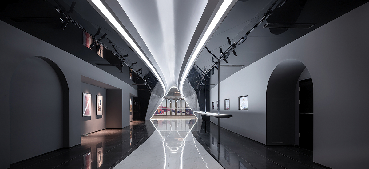
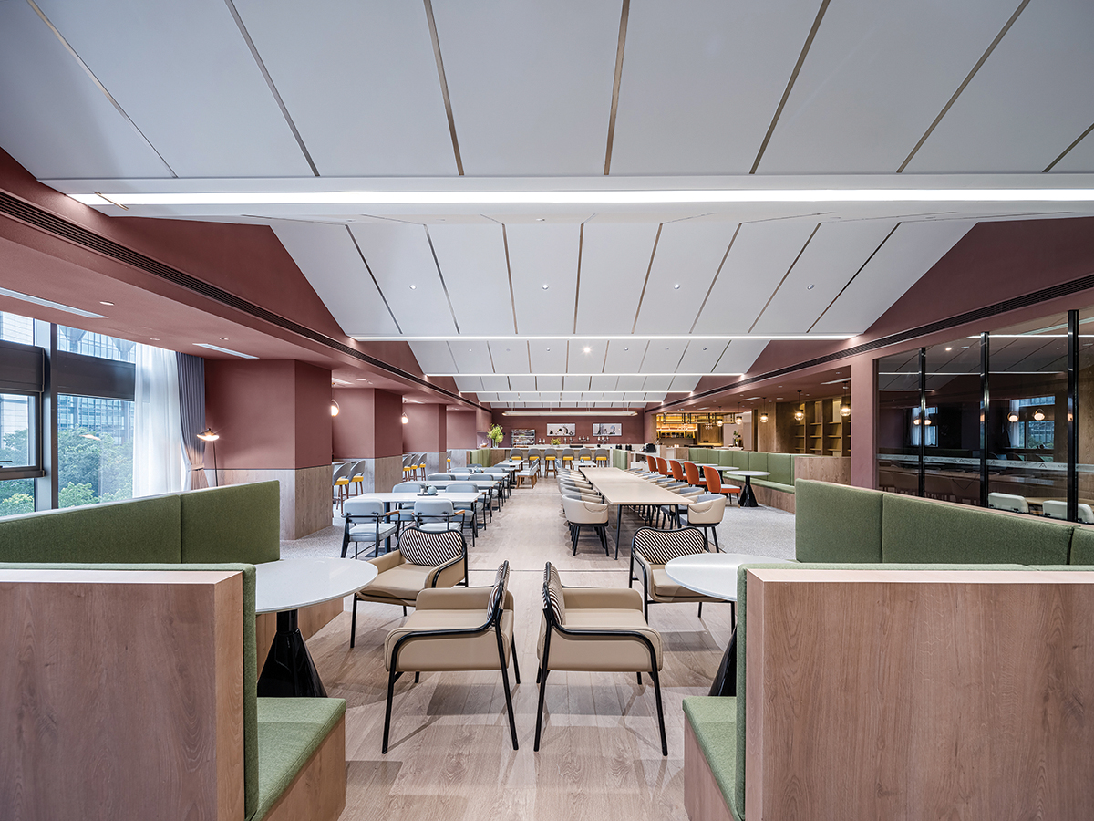
Instead of simply servicing the guests, the public area of the hotel houses all sorts of shared programs bringing in people from the neighborhood- a bookstore, a bar, a breakfast station, co-working space, event space, etc. A continuous angled ceiling folds and extends in response to the structural constraints of deep beams, and acts as a powerful architectural element that ties together the diverse programs underneath it.
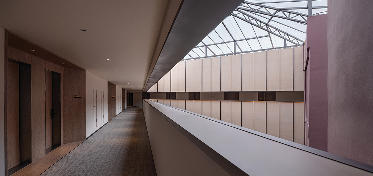
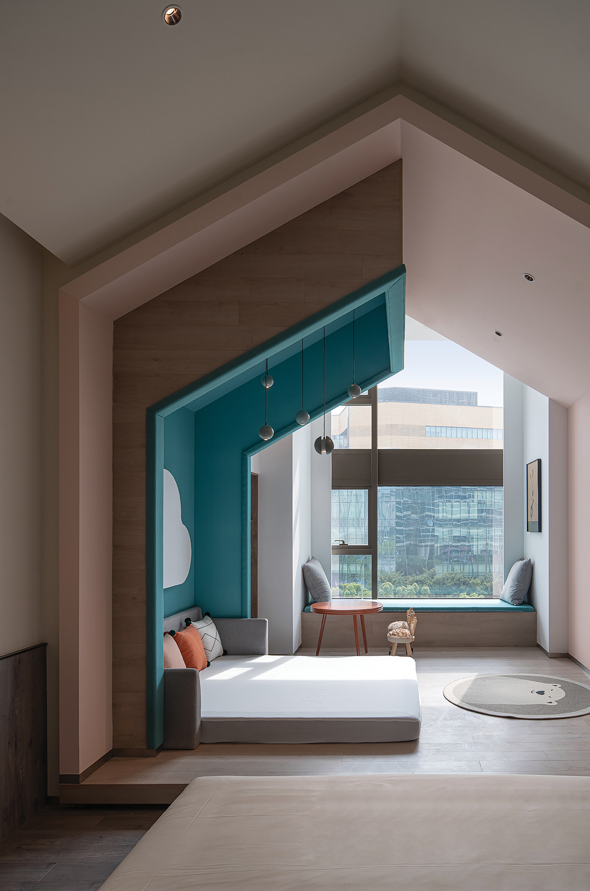
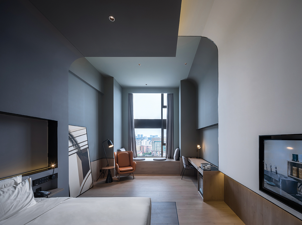
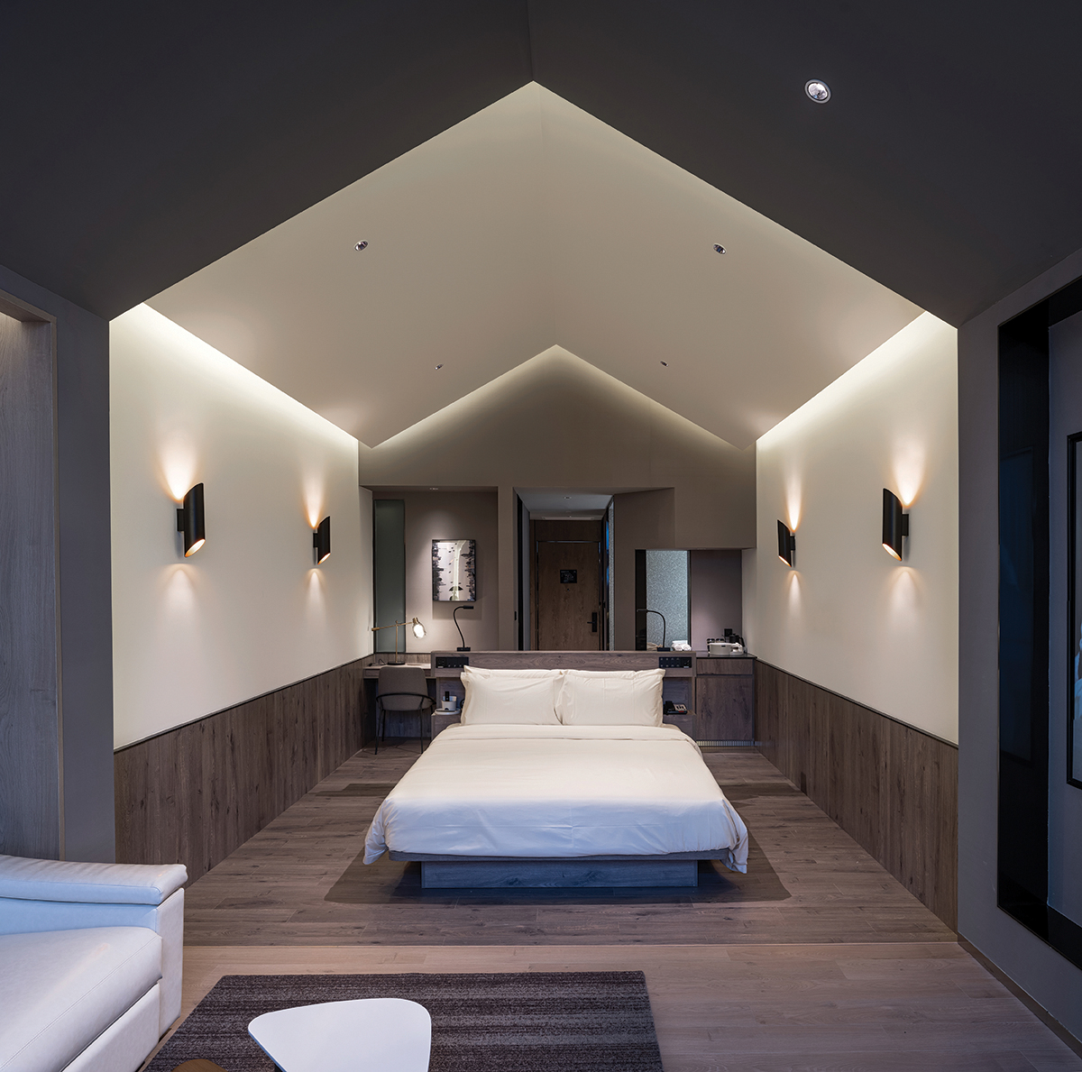
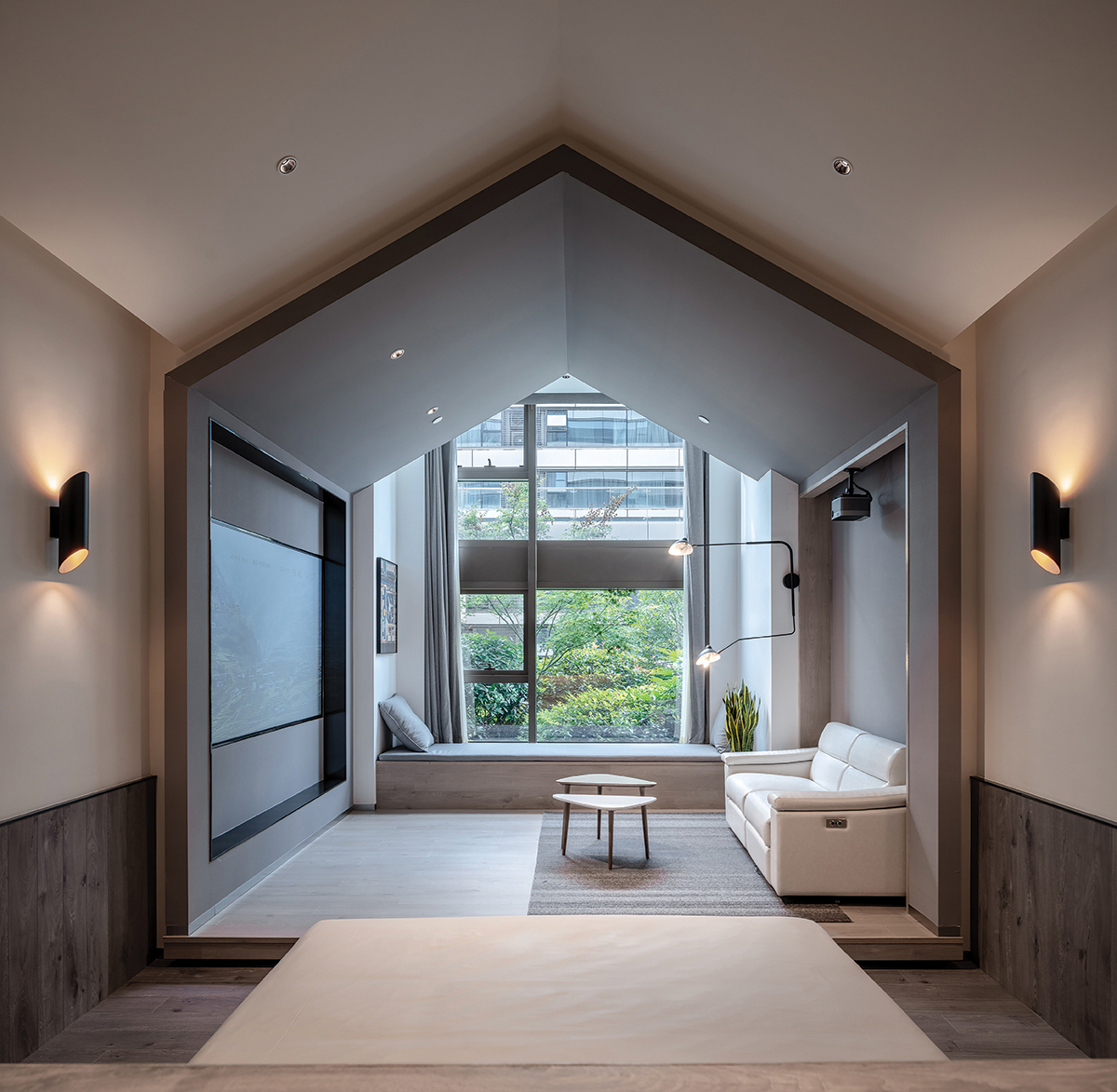
The design of guest rooms also responds to the precondition of large clearance and depth. Three themes- the “Cozy House”, the “Gallery Room”, and “Party in the woods” are designed for guests in creating a scale of intimacy and comfort. The “Cozy House” is divided from the front to the back into three zones connected by an extending pitch roof. The zone adjacent to facade is planned as “the fourth space”. It is designed as an inserted functional “house” that can be transformed into themed typologies of teahouse, fitness club, kid’s room, home theater, etc. The “Gallery Room” aims to create a feeling of “living in an art gallery”. Multiple L-shaped masses varying in sizes and materials, interlock with one another and frame the space. Paintings and accessories are placed to generate different viewports, giving the guest the unique experience of being surrounded by art works in gallery. For the suites, we envision a scenario of “Party in the Woods”. Multiple walls taking the shape of trees are arranged with different orientations to bring about the feeling of being surrounded by nature. These strong visual elements also create layers in space, framing the vistas of activities in room and the urban greenery beyond.
이지민
저작권자 ⓒ Deco Journal 무단전재 및 재배포 금지







0개의 댓글
댓글 정렬